
When it comes to design I don’t tire of illustrations and drawing. I love it, it’s an adventure.. one second I love the direction I’m on, the next I’m questioning my skill altogether, throwing out ideas and having new ones.. controlling the lines, the shapes and all the colors. It’s exciting to make a blank canvas permanently changed. However, fun illustrations of anything my heart desires is rarely what a client wants (or anyone other than your mom maybe wants). Which brings me to today’s post: My first post on my own personal creative process on designing a not so creative logo! Sure some logos are awesome and colorful but then there’s some more docile ones… for me this infosec is one of those logos.
When I first began doing logo designs I read so many tutorials on “how to create this logo” or “how to get this effect” but the most helpful tutorials weren’t simply on how, blending techniques or what brand pen to use; no, the most helpful where the “How do we arrive at this idea” tutorials. Where do I begin? How do I generate ideas? Especially for clients who don’t want anything colorful/exciting.. how do I design to something that might not come natural? I don’t have all the answers … But maybe it will help someone to see my process, a peak into my head and my creative flow.
For more info on what a logo is.. see Foundations of Logo Design on Lynda
Step 1: Receive your instruction
Here is some of what the client let me know about the desired logo:
It should speak to information security.. It needs a tag line…needs to represent that our company is a securing global partner…products that we make to keep our company secure… For our internal clients…
Ask questions if you’re unsure. For this I happened to be working with someone I know very well and was pretty familiar with the concepts.
Step 2: Sketchy
I always, always… and I stress.. ALWAYS start with a pencil. While I’m sure there are some photoshop wizards out there who can just throw it all together on the screen, that’s just not my cup’o’tea. Getting it out on paper ca be quick, albeit messy. For me, sketching lets me cycle through a bunch of bad ideas, ok ideas, some good ideas and finally a few great ones. Don’t be afraid of bad ideas! My sketches are pretty embarrassing but I would rather get that bad idea out, on paper and dismissed than spending hours trying to “make it work” on screen!
Sub step to this is your concepts.. What I like to do is pull words out of what the client has told me. I grab those words, my own and a thesaurus and just brainstorm. How do these words look? What is visual about them?
Here’s my sketches…
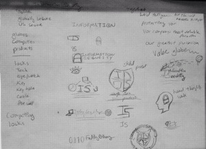
See how I wrote out my words? Drew my good & bad ideas? The more I sketch the better my final product ends up!
Step 3: Get Inspired
Usually about this time, once I’ve got my own creative juices going I may need a little extra inspiration! Or just want to see what other like brands are doing. Google is your best friend!
Here are a few sites I like to browse logos on:
One of my fave illustrators to check out is Von Glitschka.. His tutorials on Lynda are great! His explanation of what logos are, the concepts behind branding and creation are excellent!
Step 4: Pick somewhere to start!
Once I’ve got a good handle on my sketch and have boosted my idea with some inspiring designs.. I pick what I think is my strongest design and bring it in to Illustrator. I use to scan, not I find myself taking pictures with my phone instead! (I still scan detailed work)
Here’s some parts coming together!

(There many tutorials out there on making shields & logo illustrations.. Google is your friend!)
At this point I’ll focus on my strongest and once I get a decent way through I need a break. That’s when I’ll pick up another design I sketched and try that.

My first idea, with the shield, is my strongest and favorite out of these. It’s simple, direct and holds up against other similar company’s logo.

These are the main elements I’ve chosen and its important to me to create my elements and not use stock. I know stock is totally useful sometimes… but, I try to do that sparingly and only when appropriate. From here I arrange them, finalize my font choices.. And just play. I also bounce around my other ideas.
The other idea for a shield I had was something more trendy… It’s a bit of a risk because I’m not sure my client will go for it but it’s a good way to work in a different style. I create some organic shapes, adjust transparencies and use a mask to arrange it all in the shape of a shield.

Step 5: Fine Tune & Polish
Here is where the designs come together! By this point I’ve finished the elements, fonts and look. I’m just tweaking.. Cleaning up & double checking. It helps to take a walk.. Give your eyes a rest or do a different project for a while and come back. You’ll end up making changes you hadn’t thought to before.
Step 6: Pick Three
And finally… I choose three of my concepts, I’d like to show this client some options. In this case, my shield was the strongest one, the second shield was my riskiest and I wanted to round it off and do a third. My third is my weakest design (and I :GASP: used a stock globe) … Now, this client, as I mentioned I know well, so I could speak to the third if they liked that concept; however, I most likely wouldn’t have sent the third to a new client.. I just don’t like it enough.


In Conclusion:
I hope this was a bit helpful if you’re struggling with your process. Every artist is different and your creative process might change with each project. Practice and try different methods and do what works for you.

just one more thing…