Sometimes I get the chance to redo a logo. Instead of a brand new concept, I start with an idea the client already likes and improve on it. Well at a Web Slam event in Philly, that happened… I met some great people who were having trouble making their existing logo work. In the spirit of the event (helping non-profits build websites) I revamped their logo for them. The group on site loved it… however, some powers-that-be behind the scenes said.. “No, we’re sticking with what Staples made us.” It was still fun to do for them.
 Here is the original from Staples.. concept hands holding/protecting the neighborhood. Did I mention this is as big as the logo gets? This is the full resolution size that Staples could provide! I really don’t understand how they can advertise that they offer any design work with such a low quality product. However, in the end, the client wasn’t giving it up! Even if members of their group would have loved to see it go!
In my design, I made the focus the homes and lost the hands…and added their tagline: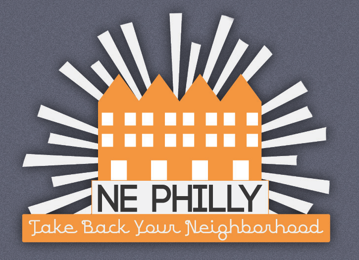
What would you have picked???

just one more thing…